*****This project is still in progress so I’ll be updating it as I go.*****
As I’m writing this, it’s Spring semester 2015 and I’m currently studying abroad in Madrid, Spain. It’s been wonderful and I’ve successfully arranged my schedule such that I have sufficient free time to read, design, and research. I met up with a friend here who is actually designing a mobile app, a travel app aimed at young adults, especially students studying abroad such as he and myself. It’s similar to Yelp in that it will help recommend things to do in certain cities, like restaurants, attractions, and transportation, but it will also have the capacity to give tips to first-time travelers or even seasoned veterans.
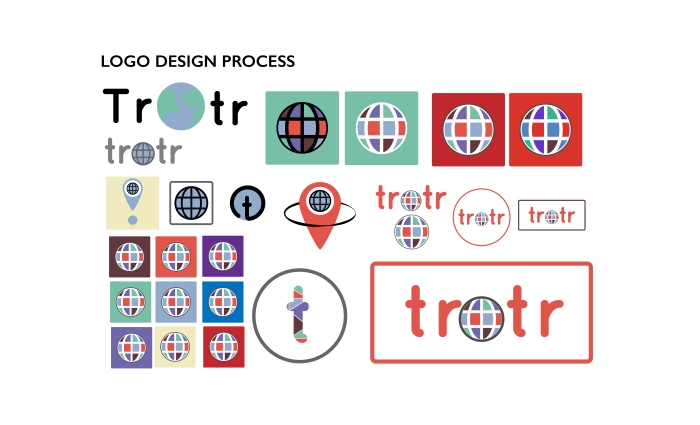
When he found out that I was a designer, he gave me the task of designing the various screens of the app. There’s already a beta version that he and his team are testing, but they want a new design when it comes time to launch. I was given a few guidelines on the color scheme and look of the app. My friend was looking for a colorful but not “rainbow-y” scheme, close to a primary color scheme. He also wanted to not be too close in appearance to Facebook; although it is a social networking app, he wanted it to be set apart from other well-known sites.
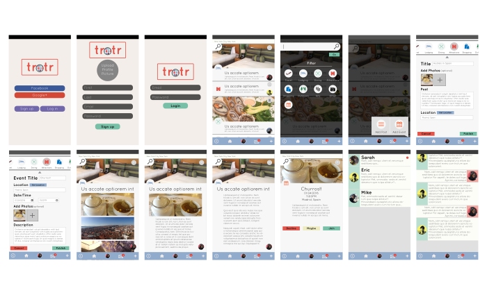
The initial app launch would only be concerned with the basic screens, Profile, Newsfeed, and Messaging. Since I had some extra time on my hands, I also went ahead and designed a Sign-up screen where the use can use either their email or their Facebook information to sign-up.
First Iteration:
First of all, here were some designs for the home screen:


Designs for the newsfeed screen. It also includes a hidden main menu in order to not have the home screen:


Designs for the messaging screen:


Designs for the sign up screen:


App as a whole:


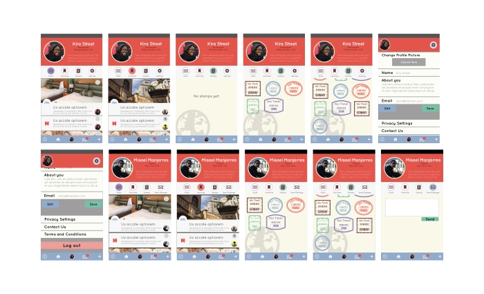
Second Iteration:


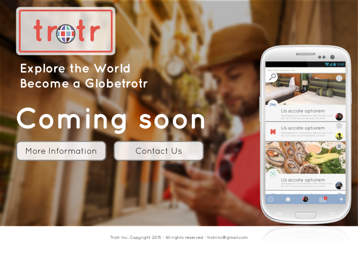
Third Iteration: